
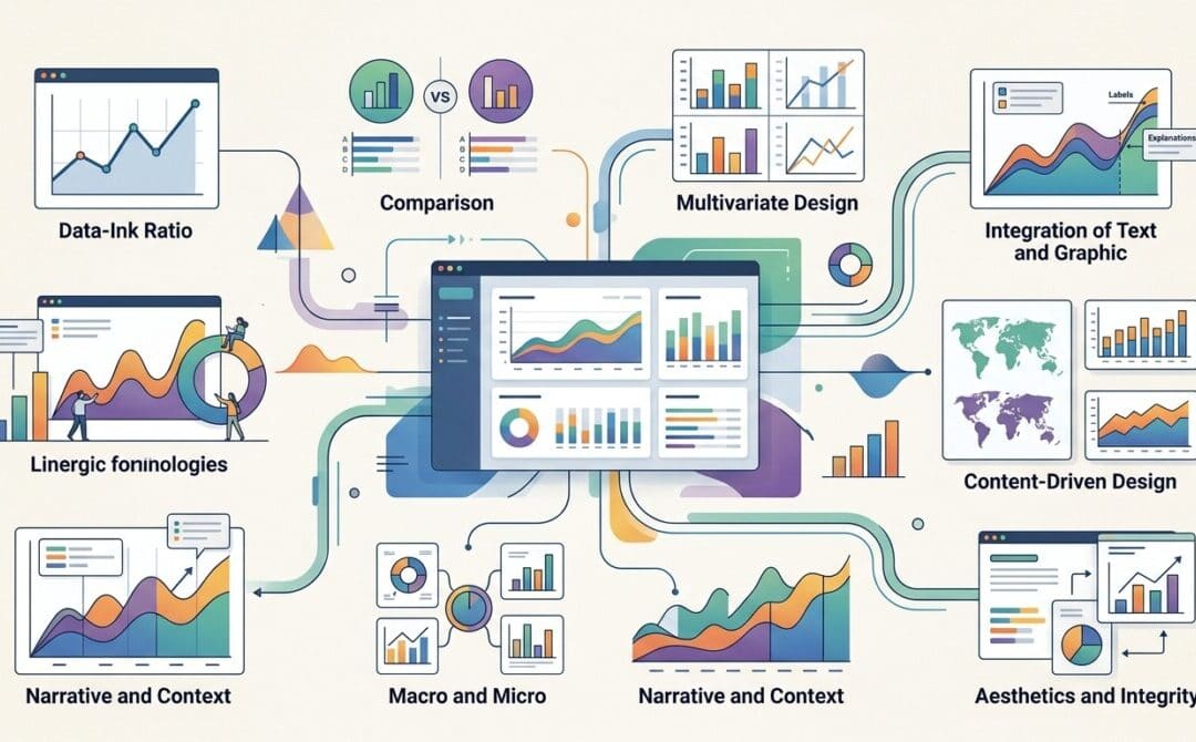
When it comes to creating dashboards, many designers fall into the trap of prioritizing style over substance. While sleek designs may look impressive, they often fail to communicate data effectively. In a recent video by Adam Finer of Learn BI, he breaks down key principles from Edward Tufte’s book, The Visual Display of Quantitative Information, to help dashboard creators focus on clarity and functionality. Let’s explore these eight fundamental principles and how they can improve your data visualizations.
1. Show the Data
The primary goal of data visualization is to make complex data sets understandable. Tufte highlights the importance of visually representing data in a way that reveals patterns, trends, and insights. For example, he references Anscombe’s Quartet, which demonstrates how datasets with similar statistics can appear vastly different when visualized. The takeaway? Always prioritize the data itself over flashy design elements.
2. Focus on Substance, Not Style
Effective dashboards should guide viewers to think about the data, not the design. Avoid unnecessary elements that distract from the core message. Adam emphasizes this point by advising against overcomplicating dashboards with excessive colors, 3D effects, or decorative features. Instead, aim for simplicity and clarity.
3. Avoid Distorting the Data
Misleading visualizations can distort the story your data tells. A common mistake is manipulating the y-axis to exaggerate trends. Always ensure your visualizations accurately represent the data, as any distortion undermines trust and credibility.
4. Present Many Numbers in a Small Space
One of the key advantages of visualization is its ability to condense large datasets into digestible formats. However, this must be done coherently. Using unsuitable charts or excessive colors can make data harder to interpret. Choose the right visualization type and keep it clean.
5. Encourage Comparisons
Data becomes meaningful when it can be compared. Standalone figures lack context, but side-by-side comparisons help viewers draw insights. Ensure your visualizations make it easy to compare data points and identify correlations.
6. Reveal Data at Multiple Levels
Dashboards should provide both a high-level overview and the ability to drill down into finer details. Modern BI tools make this easier with interactive features like filters and drill-down options, allowing users to explore data at their own pace.
7. Serve a Clear Purpose
Every dashboard should have a well-defined objective. Avoid cramming too much information from different data sources into a single view unless it serves a specific purpose. If multiple data sources are necessary, ensure they are clearly distinguishable.
8. Optimize the Data-to-Ink Ratio
Tufte’s concept of the data-to-ink ratio emphasizes minimizing non-essential elements in visualizations. Adam demonstrates this by removing redundant elements like borders, excessive grid lines, and repeated labels. The goal is to let the data take center stage while reducing visual clutter.
Common Mistakes to Avoid
Adam also highlights frequent pitfalls in dashboard design:
- Oversized Charts: Optimize space by reducing chart sizes without compromising readability.
- Inconsistent Colors: Use consistent colors across charts to avoid confusing viewers.
- Overuse of Pie Charts: While pie charts can be effective for showing parts of a whole, they should be limited to datasets with fewer than five values. Consider alternatives like bar charts or donut charts for better clarity.
Conclusion
By following Edward Tufte’s principles and Adam Finer’s practical advice, you can create dashboards that are not only visually appealing but also highly effective at communicating data. Remember, the ultimate goal of data visualization is to make information clear, actionable, and easy to understand. Keep these principles in mind, and your dashboards will truly stand out.
Source: 🚨 YOU'RE VISUALIZING YOUR DATA WRONG. And Here's Why…